| Alexander McQueen (British, 1969–2010). Dress, autumn/winter 2010–11. Courtesy of Alexander McQueen. Photograph © Sølve Sundsbø / Art + Commerce |
 |
| Giuseppe Sammartino (1720 - 1793). The Veled Christ |
designhacks & other modes of Architecture
Moving geometry in and out of Maya can be difficult, especially moving geometry in a useable format between the two platforms. There have been attempts to move the geometry through a number of mediums, including .iges, .obj, .dwg, etc. I’ve found the majority of these to fall short in the face of highly articulated geometries. Rhino provides certain benefits over Maya, such as grasshopper and fabrication compatibility, but lacks much of the mesh control provided for in Maya.
In order to maintain the fidelity of the NURBS geometry, knowing that the geometry will be further worked in Maya, do the following:
The upper screenshot below is of a surface in Rhino. The left geometry is a NURBS surface. The right geometry is the control polygon.
In the lower image is import geometry in Maya. The mesh on the right is the control polygon imported from Rhino. The surface on the right is a subdivided mesh straight from the control polygon (press “3” in the software…). Note that they are identical.
The only shortcoming of this method is that it only exports a single surface at a time, so if there is any mass to your NURBS model, each surface will need to be extracted and exported separately.

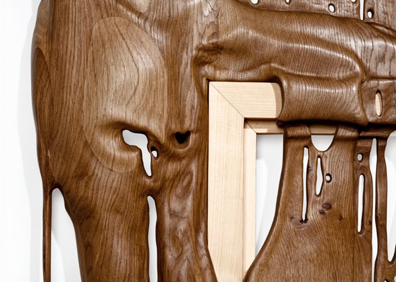
DURAMEN is a series of handmade wooden sculptures. Born of a simple impulse, the one to break with conventional ways of exhibiting, Bonsoir Paris and its team have imagined a series of frames so strongly mistreated that they have become unrecognizable. Their wish is to break the properties of the compound, a form of compromise as minimal and it is efficient. They found a subtle twist while remaining faithful to a primitive form of revolt, without getting lost in vain styles effects. The choice of noble materials (Oak, Fir, Wenge, Pear, Linden) and the quest for finesse, enables them – with the DURAMEN series – to position themselves on the razor’s edge between two opposites, that of the deformed and that of the elegant, instinctive and thoughtful.[website]


Ausgeführte Bauten und Entwürfe von Frank Lloyd Wright
Following the release of the Wasmuth Portfoliob Le Corbusier, van der Rohe, and Gropius, all working for Behrens in Berlin, purportedly stopped work the day the portfolio was released. I don’t know which is more incredible: those three designers all working in the same shop or that they (supposedly) stopped work, apparently in review of the monograph.
In any case, the portfolio (both volumes) is hosted in all its entirety online for anyone to check out. If you like hand rendering or Wright’s work, it’s a great find.
link: lib.utah.edu
 In the article John Peterson of Public Architecture notes that his company is also trying out Prezi as well. He notes, “It’s…about presenting in a new way, rather than just improving what we’re already doing.”